

I’m glad to announce that the game map, which was unpolished for quite some time, is finally finished! Here’s a sneak preview!
Board games & colorblindness
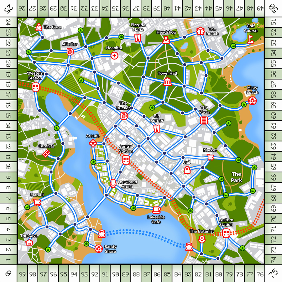
We’ve had our map prototype for quite some time. About two weeks ago I showed it to my friend Elias. He told me it’s very hard to see where the green circles were on the map. The orange and green circles were very hard to tell apart for him. Turned out he has deuteranopia! This was a revelation for me, as I hadn’t considered the repercussions of making a game with no considerations for the colorblind! I simply couldn’t see the problem.
What a stroke of luck this was! We revised the map with him – and now it’s way more clear than before! And it’s also clearer for people with no color discerning problems! We still have to compromise on the colors somewhat – if the map was designed only around deuteranopia, the design would suffer for most users.
The most important thing was using icons in addition to color coding. Icons on the map are far more accessible than only color circles. We’ve also coded all the quest cards so that you can instantly see where you are going by comparing the icons on the cards to the icons on the map.
Adobe has a good article on proofing graphics files for the colorblind. There are ready settings for color proofing your materials! If you’re making a board game I highly suggest checking out the article and proofing your documents for maximum accessibility!